Cerith Wyn Evans, The Illuminating Gas… (after Oculist Witnesses), 2015

Cerith Wyn Evans

The Illuminating Gas… (after Oculist Witnesses), 2015

White neon

378 x 319 x 191 cm

Cerith Wyn Evans, The Illuminating Gas... (after Oculist Witnesses), 2015

Cerith Wyn Evans, The Illuminating Gas… (after Oculist Witnesses), 2015

The Illuminating Gas… (after Oculist Witnesses), displayed right at the entrance of the South Galleries of White Cube Bermondsey in London, is an installation of Cerith Wyn Evans  with three vast discs in bright white neon suspended from the ceiling at a skewed angle, imposing a foreshortened perspective.

The inspiration of the installation is drawn from the mysterious tripartite radial forms of the ‘Oculist Witnesses’ in Marcel Duchamp’s work The Bride Stripped Bare by Her Bachelors, Even, most often called The Large Glass (Le Grand Verre), 1915–23.  The Illuminating Gas… (after Oculist Witnesses) recreated the forms of Duchamp’s original work into multi-dimensional objects.

Duchamp’s art does not lend itself to simple interpretations.  For The Large Glass, while some critics read the piece as an exploration of male and female desire having complication as its upper and lower realms are separated from each other forever by a horizon; other modern critics see the painting as an expression of the artist to ridicule criticism.  The installation of Cerith Wyn Evans stages the exploration of established and establishing time-space relationship, separating itself from the surrounding visual field.  The forms fold and mesh different figures into each other, thereby evoking unforeseen registers of perception.

Born in Wales in 1958, Wyn Evans studied at St. Martin’s School of Art in London, where he first began to use unorthodox materials in his artwork.  Wyn Evans began his career as a filmmaker — it wasn’t until the 1990s that he turned his attention to installation artwork as well.  Looking at his creation, his background in the visual becomes extremely obvious.  Much as a director uses light and darkness in his movies to create a desired emotional response, the artist plays with refracting mirrors and flashing lights to guide his audience’s reaction to his work.  As a conceptual artist, sculptor and film-maker, his installations, sculptures, photographs, and films direct to evoke “polyphony, superimposition, layers, levels, the occluded, and the visibility”.  What drives his practice is his fascination with perception—how we understand texts, language, our surroundings, and each other.  The artist combines and re-presents recognizable objects, texts, and images to catalyze a multiplicity of new, open-ended meanings.

In the same room, the artist also displays three neon works which are suspended from the ceiling taking their forms from the codified and precise movements of Japanese Noh theatre (Neon forms [after Noh I, II and III], all 2015).  These works present a maze of complex lines that trace the trajectory of alignments, gestures, folds, orientations and footsteps; transposing and transforming energies into both material charge and visual form.

According to White Cube, Wyn Evans’ works exist and take their form through the reflection on and interrogation of the world about us, adopting what Martin Prinzhorn has identified as strategies of ‘superimposition and contradiction, by concealing and revealing’, to create moments of rupture within existing structures of communication whether visual, audio or conceptual.  The artist has focused on ideas around the flows of energy via material and immaterial conduits, circuitry and choreology – the practice of translating movement into notational form.

Interspersed amongst the neon works are plants placed on turntables that rotate almost imperceptibly, enhancing the otherworldly atmosphere.  At the far end of the room a sound sculpture constructed of 19 “breathing” transparent glass flutes emit what White Cube describes as “a mellifluous breath-like sound.”  In the corridor space Evans has reconfigured an existing ceiling light fixture to convey in Morse code a text that describes the transit of the moon creating a solar eclipse.

The works on display takes on Evans’ signature style of tracing the complexity of gestures, motions and shapes in light.  It is a characteristic paradox that Wyn Evans chooses light to transmit obscurity.  His creations make viewers question their preconceived notions about artwork and perception, making them ponder whether they’re looking upon bright neon lighting or translated versions of philosophical questions.

Exhibition of Cerith Wyn Evans

White Cube Bermondsey, London

23rd September to 15th November 2015


Cindy

image (2)          53d154554156486e385c7d40_TwitterBlack-Circle-Icon_Email1-940x940download

Marc Quinn : Frozen Waves, Broken Sublimes (2015)

Marc Quinn

Frozen Waves, Broken Sublimes (2015)

Stainless Steel

Sculptures, Variable dimensions


Four monumental sculptures by Marc Quinn, being two bodies of work entitled respectively Frozen Wave and Broken Sublime (2015), are presented in Somerset House’s historic Edmond J. Safra Fountain Court.

The four sculptures, namely Frozen Wave (The Conservation of Mass), Frozen Wave (The Conservation of Energy), Broken Sublime (The Invention of Tools), Broken Sublime (The Hunger), originate from the remnants of shells.  Created with stainless steel, the contrast between the unpolished and highly polished reflective surfaces adds to the works the aesthetic – elegant and minimal.  Their monumental scale works amidst the courtyard’s fountains underline the works’ connection to water.  All denote a conversation with the nature and the environment.

With primal and maritime sculptural shapes, the sculptures express the altered states of shell forms either by natural causes (like wave erosion) or by humans (by their consumption).  In the moment before they disappear and become sand, all conch shells end up in a similar form – an arch that looks like a wave, as though an unwitting self-portrait by nature. With titles referencing the science of fluid dynamics and rendered in different scales and cast in stainless steel or concrete, the result appears like a sculpture of a wave yet also something primordial and ambiguous, mined from the depths of time. They point to a magical material transformation: the crystallization of movement into form.

‘Somerset House is a kind of urban beach of the Thames. Built on land which articulates the transition between the urban strand and the water of the river, it is the littoral zone of the city.  By placing the cast stainless steel sculptures in the courtyard surrounded by the fountains, the water of the ocean which formed the sculptures’ shapes is linked to the tamed water of pipes, conduits and drains of the city’. (Marc Quinn, 2015)

This British sculptor and visual artist is perhaps not new to most.  He creates provocative sculptural portraits composed of organic materials.  He is better known for Alison Lapper Pregnant, a sculpture of a woman who was born without arms when she was heavily pregnant, which has been installed on the fourth plinth at Trafalgar Square.  If not, his ongoing series of “Blood Head” self portraits – Self, in which a cast of his head is made with over nine pints of his own frozen blood.  Quinn’s sculptures, paintings and drawings often deal with the distanced relationship we have with our bodies and with nature, highlighting how the conflict between the ‘natural’ and ‘cultural’ has a grip on the contemporary psyche.  The artist uses an uncompromising array of materials, from ice and blood to glass, marble, spray paint and lead.  He also fabricates sculptures using more traditional media such as bronze, often depicting contorted bodies or people with unusual physical characteristics – amputees, or those who have undergone sex-change surgery.

Marc Quinn: Frozen Waves, Broken Sublimes

Edmond J. Safra Fountain Court, Somerset House, London

17th September to 21st October, 2015


Cindy

image (2)          53d154554156486e385c7d40_TwitterBlack-Circle-Icon_Email1-940x940download

Nedko SOLAKOV, Good News, Bad News (Villa Manin), 2008

Nedko SOLAKOV

Good News, Bad News (Villa Manin), 2008

12 spotlights and mixed media

Variable dimensions


Good News, Bad News is the title of an installation of the Bulgarian artist Nedko Solakov.  It consists of islands of light on the floor, and in the spotlight of which are the small scenarios of good and bad news.  Life is full of good and bad news, some of which have a positive side.  The same underlying meaning also found in the classic example of a half-full or half-empty glass, presented by Solakov as an ironic paradigm of bifurcation, a sly commentary on human existence.

Nedko Solakov was born in Cherven Briag, Bulgaria in 1957.  The artist has studied at the Academy of Fine Arts in Sofia and lives and works in Sofia.  Since the beginning of the 1990s, Nedko Solakov has exhibited extensively in Europe and the United States, such as Documenta 12 (2007) and Documenta 13 (2012), and the 2001, 2003, and 2007 Venice Biennales. His work has been included in exhibitions at institutions such as the Tate Modern, the Centre Pompidou, the Stedelijk, and the Israel Museum.

In this installation Good News, Bad News, Nedko Solakov employs an ironic, metaphoric and poly-semantic style to analyze the role and contradictions inherent to the contemporary art system, its communicative mechanisms and its schizophrenic relationship with the society and cultural geopolitics.  The text in each scenario plays an important role in the whole installation.

Language was an important tool for Conceptual artists in the 1960s.  Many Conceptual artists used language in place of brush and canvas, and words played a primary role in their emphasis on ideas over visual forms.  Thinking about using text in contemporary artwork, we may probably recall the work of conceptual artist Joseph Kosuth, One and Three Chairs (1965).  Joseph Kosuth was among the first to give words such a central role.  Another example could be I Will Not Make Any More Boring Art by Baldessari, who has repeated the same phrase over and over again.

Conceptual art is a movement that prizes ideas over the formal or visual components of artworks.  An amalgam of various tendencies rather than a tightly cohesive movement, Conceptualism took myriad forms, such as performances, happenings, and ephemera.  From the mid 1960s through the mid 1970s, conceptual artists produced works and writings that completely rejected standard ideas of art.  Language itself has an ultimate significance in Conceptual Art and there are far more examples than we can cite.

Text of some scenarios of the installation Good News, Bad News:

  • The good news: the bird finally found (in this hostile environment) two semi-enclosures that might be suitable for giving birth.

The bad news: no bad news, just a hot sex related thoughts.

  • A big problem is pressed under this stone (and it looks it would stay forever pressed), which is good news.

However, there is a hint of bad news: the stone has to pee and he is very shy – he can’t do it in front of you.

  • There is no data on it, which maybe a good news.There are also many colorful reflections on its surface (because of the spotlight), which for sure is a bad news because such reflections are, in general, useless.
  • The bad news: too much “Holy Shit!” expressions nowadays.

The good news: there is a device to clean them out.

  • The bad news: these pebbles are not precious at all.

The good news: there is at least one of them (somewhere at the bottom) who will become a big shot, eventually.

  • Four good and four bad news are going to be filed*. It seems that they will become friends which may be both – good & bad news – it depends on the point of view.
  • A very simple, casual ornament wants to be as beautiful as the sophisticated features in this room. Needless to say that he can’t, which is not necessarily bad news for there are a lot of foundations that will make him look beautiful (or at least expensive).
  • Very soon he (from the Big Book) is going to destroy (to melt down) these bloody figures/ numbers which is a pity because they are not really bad and evil. Why?

This is the answer, which is still classified information because of the global warming.

  • The good news: she finally got the pet she wanted.

The bad news: the pet didn’t like her.

The good news: she was still a noble lady.

Another bad news: the cat was even more noble than her, because her grand, grand, grand mother used to be a court cat in a much bigger castle than the young noble lady’s one.

The final good news: a pet dog with no noble predecessors whatsoever is on his way to join the two of them

  • As many historians (and gossip makers) wrote, Napoleon had a big problem. The good news: luckily his problem was hardly visible.

Follia Continua

CENTQUATRE-PARIS

26th September to 22nd November 2015


Cindy

image (2)          53d154554156486e385c7d40_TwitterBlack-Circle-Icon_Email1-940x940download

Fragonard in Love (Fragonard Amoureux) – an exhibition more than just “Erotic”

The Musée du Luxembourg seduces us once again with a new exhibition “Fragonard Amoureux”, an exhibition which revisits the works of Jean-Honoré Fragonard (1732-1806) who is considered one of the major figures in French painting during the 18th century or the last decades of the Ancien Régime.

Considered a painter of frivolities, Fragonard also excelled in the fields of historical, genre and landscape painting.  But he is most identified with the erotic genre and was popular with the courts of Louis XV and Louis XVI for his delicately pastel colored scenes of seduction, love and hedonism.   Fragonard often painted scenes of gallantry and debauchery, exploring in this manner the various aspects of sensuality and sentiment.

He left behind several exemplary masterpieces: L’Inspiration (a self-portrait), The Lock, Young Girl Reading, La chemise enlevée (The Shirt Removed), The Stolen Kiss and The Swing, to name just a few.  One of his chief works “Les progrès de l’amour dans le cœur d’une jeune fille,” was commissioned by Madame du Barry, Mistress of Louis XV for her chateau at Louveciennes.  Once being gallant, libertine, and concerned with new love ethics, his art had a great influence to the art scene in the half of the century to follow.

The exhibition is divided into different sections under the themes: “The Gallant Shepherd”, “The Loves of Gods”, “Rustic and Popular Eros”, “Fragonard, Illustrator of Libertine Tales”, “Pierre-Antoine Baudouin, A Libertinist Master”, “Fragonard and Licentious Imagery”, “Dangerous Reading”, “The Revival of the Fête Galante”, “Love Moralised”, “Heroic Passion” and “Romantic Allegory”.  All these together conveyed the theme of love and romance.

Erotic?  But what else?

A lot of comments of this exhibition revolve around the word “erotic”.  Without doubt, Fragonard’s scenes were pretty scandalous in his era, more or less pornographic.  Some of the content of his paintings and drawings remains shocking even in the society today.  The artist has once declared “I paint with my ass”. ( “je peindrais avec mon cul”)

But other than focusing on this “erotic” aspect, what else could we take away from this exhibition?

A lesson on the mythological love stories

Love is omnipresent in the works of Fragonard.  The exhibition offers a chance for us to revisit the questions of love during the development of time, from the “Grand Siècle” to the Regency.  The concept of gallantry represented one of the values of French identity in the 18th century.  Between 1740 and 1750, the mythological fables of Antiquity illustrated by François Boucher and his disciples became the symbol of a frivolous, even licentious, form of painting.  Since Regency (1715-1723), libertinism had triumphed among the elite by adopting the forms and civilized veneer of gallantry, while in actual fact being a hedonistic quest for carnal pleasure that was completely detached from romantic sentiment.  It was under this influence that Fragonard was trained.  The walk-through of this exhibition is indeed a good opportunity to get a grasp of the mythological love stories during these eras.

 A revisit of the fable of La Fontaine

People having studied the literature or culture of France would have certainly come across the fables of Jean de la Fontaine.  The 18th century represented the glory days of the illustrated books.  The publishing of La Fontaine’s Contes (Tales), which were considered one of the main sources of all libertine literature of the 18th century, was a real triumph at that time.  Fragonard studied the illustrations of the Contes at the end of his stay in Rome and during the 1760s, and has dedicated several series of drawings on this.  The largest album making up of fifty-seven pages and conserved at the Petit Palais is displayed in this exhibition.  What is more encouraging is that the album is accessible online at www.petitpalais.paris.fr, under the section “Étudiants et chercheurs”.

From a different perspective, perhaps we can perceive the works of Fragonard as his frank expression of emotion, where courting lead to sensual encounters.  By going through section to section of the exhibition, our mind travel from the last flames of gallant love and the triumph of libertinism, to the blossoming of a more sincere, sensitive and already “romantic” version of love.

(The exhibition is held from 16th September 2015 – 24 January 2016 at Musée du Luxembourg)


Cindy

image (2)          53d154554156486e385c7d40_TwitterBlack-Circle-Icon_Email1-940x940download

The 13e Biennale de Lyon (Lyon Biennial) – An Interpretation of Modern Life

The 13e Biennale de Lyon (Lyon Biennial) has begun on 10th September last week.  This year, it begins a new trilogy under the theme of “modern”; a theme that Thierry Raspail, artistic director of the Biennial, gave to Ralph Rugoff, guest curator for the 2015 edition.  60 artists from 28 countries have participated in the biennial and their works are mainly located in 3 venues namely MAC Lyon (Museum of Contemporary Art), La Sucrière, the Musée des Confluences.  The artists offer their personal vision of the contemporary world and invite the audiences to go into this contemporary world through their works.

A visual and auditory experience actualized by the installations in the space

The visual and auditory effects of the installations mingle together to yield a novel experience for the audiences.  The work Taut Eye Tau created by Alex Da Corte is a study of the color yellow undertaken through the exclusive use of its “opposite color” blue.  It consists of a decor that recalls both the Stanley Kubrick-style science-fiction and the subtle processes of Sol LeWitt-style abstraction.  Taut Eye Tau is a total environment: it includes pieces of furniture, a carpet, sand, neon tubes and a video projection whose soundtrack is also based on the color blue.  This single color of blue brings to mind the seas and the sky, absence and desire, the horizon and the immaterial.  It implies to us that what we see as real is instead usually not too complete.  A strong visual implication exists.

At the other side, the Glass Troll Cave (glass cabinet and flat screen) and Erysichthon (HD video) created by Jon Rafman provide a combined visual and auditory experience.  The digital technology and the new media hold the world at a distance.  In his installations, photographs and videos, Jon Rafman expresses a sense of melancholy and irony to our social tradition and virtual communities.

IMG_9914

Glass Troll Cave (glass cabinet and flat screen) and Erysichthon (HD video) created by Jon Rafman

We cannot go round this point without mentioning the work of Céleste Boursier-Mougenot, aura, 2015.  In his work aura, the drum head is struck by cherry stones, triggered by the electromagnetic aura given off by each owner of a cell phone who visits the Sucrière.  The sound produced by the fall of the cherry stones is thus random and variable.  This work gives a new interpretation to his previous work in 2013, in which water falls to strike a drum kit.

Conceptual artworks leave room for the imagination and participation of audiences

Perhaps what makes this year’s biennial interesting to the audiences is the room for their imagination and participation.

Pull over time created by Michel Blazy is a combination of technological objects like computers or cell phones, and manufactured objects like a branded sports shoe.  The artist grows things in them, as if in a vegetable patch.  Colored water runs down the walls all the time.  All the visual effects produced by the decay of these objects are an integral part of the work, and this goes against the belief that the finished products are impervious and resistant to change.

Nina Canell’s installation Mid-Sentence gives concrete expression to the lightness and intangibility of the everyday life.  Mid-Sentence consists of subterranean cable-cuts and compressed fiber-optic “sheaths” like conductors and transporters.  Arranged like relics, these cables evoke both the idea of dissolved geography and corrupted representations of language and body.

IMG_9948

Nina Canell’s installation Mid-Sentence

Lai Chih-Sheng’s work Border provides a vivid example of conceptual of the space.  The artist displays waste materials from the construction on the floor, with a border/ platform suspended over a vast space.  The artist places the importance on the audience’s experience.  Visitors are invited to walk on the border.  They would find themselves on the visual border between the physical reality of the space where the work of art is deployed.

Modern life – the past, present and future

One may ask in what sense these works are related to the theme “The Modern Life”?

Perhaps the first thing to put in place about “modern life” is the “problems” nowadays, in the context of “everyday life” scenarios throughout different regions in the world.  “La vie moderne” includes works that take on some of the most perplexing and troubling issues of our moment — from the growing inequality of wealth in society and consumer culture to the questions around immigration, post-colonial relations and our changing relationship to the world around us and our relationship with each other.

The artists explore the contradictory and contingent nature of the modern, both on an aesthetic and philosophical level as well as in the area of social formations, subjectivity and technology.  They express their ways of seeing and thinking about the world around us.  Like in the work of Guan Xiao, he has created a video installation made of ten screens and surrounded by three sculptures.  The particular materials used come from various different periods and cultures, bringing together a time where the future and the past will overlap.  The video installation is a collage of found images from the internet collected by the artist over the course of several years.  The artist has staged her own vision of the world – one with overexposure to images that surround us.

Another point worth to notice is the relationship between the past, present and future.  “Modern” is shrouded in uncertainty, as is our relationship between past and present. To describe something as “modern” today imbues it with an aura of uncertainty — it suggests something haunted by various “modern” episodes in history while at the same time retaining something of its traditional sense.  We cannot mark a significant break with the past. We cannot escape from history.  Instead, our only choice is to work through and re-direct its legacies.  We would rather interpret modernity as an evolving process, which embrace the past and elongate to the future.

Emmanuelle Lainé brings to us similar intonation in her work « Il parait que le fond de l’être est en train de changer? ».  The artist used elements that she had made beforehand (flat screens molded in silicone) and others that she “arranged” on the spot (pieces of furniture, plants, packing cases…etc.) to set up a vast treasure hunt.  She kept adjusting and correcting the scene until she finally made a wide-view photograph of her creative process.  After the photograph was fixed to the wall, she then destructed and modified the scene.  Objects now become images, which then become objects again.  These narratives through time and dimensions reflect also a shuffle between the past and present – an echo with the underlying interpretation of modernity.

Along with this sense, we may believe perhaps the most truly contemporary art doesn’t present us with endless novelty, but with new ways of working through history.


The 13e Biennale de Lyon will last from 10th september 2015 to 3rd January 2016.

Official website of the 13e Biennale de Lyon (Lyon Biennial) : http://www.biennaledelyon.com/


Cindy

image (2)          53d154554156486e385c7d40_TwitterBlack-Circle-Icon_Email1-940x940download

Une expérience révélatrice dans un « musée alternatif »

Si l’émergence de l’art contemporain passe par la remise en cause des idées traditionnelles qui définissent l’art, elle touche aussi à la manière d’admirer les œuvres d’art et nous mène en dehors des lieux de visite traditionnels.  En effet, il n’est pas forcément nécessaire de pousser les portes des musées pour apprécier des œuvres d’art.  Eight Kwai Fong a réalisé un appartement artistique : le « musée alternatif ».

Il est plutôt difficile d’imaginer un « Appart ‘hôtel » dédié à l’art.  Néanmoins, une visite de ce nouvel appartement à Hong Kong nous ouvre les yeux sur ce concept.

En pénétrant dans le premier salon, la vision des livres d’art de l’éditeur TASCHEN de la librairie de la rue de Buci me reviennent à la mémoire. C’est un lieu où presque tous les étudiants en histoire de l’art ont envie de feuilleter quelques ouvrages.

Une réflexion d’images, une réflexion de vie

Le flot de lumière naturelle, les matériaux réfléchissants, la finesse et les formes dissymétriques de l’art décoratif font entrer la nature dans la salle.  Le vase conçu par Todd Bracher, disposé dans le couloir, exprime ce mélange de la vie et de la nature.  Ce dernier, représentant le corps d’une femme, est empli de fleurs.  La surface du miroir reflète ces fleurs, créant un effet dramatique qui accentue la couleur naturelle et la texture des fleurs.  Le vase et son contenu créent une vision totalement unique qui change selon l’arrangement des fleurs.

Cette nature diffusée invite à la conversation avec l’œuvre placée sur le mur – Paradise 28, Rio Madre de Dios, Peru, 2005 de Thomas Struth.  Thomas Struth est un artiste et photographe allemand, qui a d’abord étudié la peinture à la Staatlichen Kunstakademie à Düsseldorf avec Gerhard Richter, et puis, la photographie avec Bernd et Hilla Becher.  La pratique artistique de Thomas Struth est caractérisée par ses séries, par exemple, des photos de rues, des portraits, des fleurs, des familles, des musées et des paysages.  Thomas Struth est surtout reconnu par la critique et le marché de l’art pour ses séries sur les rues Die Architektur der Straßen et la série Portraits.  Fasciné par la culture maya et sa relation à la nature dynamique, Struth a commencé la série Paradise à la fin des années 1990.  Il a fait ses recherches dans les forêts et les jungles du monde entier en voyageant en Chine, au Japon et en Australie.  Avec l’ambition de « faire un autre type d’œuvre avec un sujet différent », il a présenté ses nouvelles photographies avec une multiplicité de couches et une densité de détails.  Ses œuvres contemporaines évoquent les forêts vierges d’Asie, d’Océanie, d’Europe et d’Amérique du Sud.

Mais la réflexion est non seulement physique, elle est également mentale.  Eskimo, une huile sur toile de Zhao Yang, nous donne une réflexion sur la philosophie intrinsèque de la vie.  Né dans la province de Jilin en 1971, diplômé de l’Académie chinoise des arts en 1995, Zhao Yang vit et travaille actuellement à Beijing.  L’artiste se consacre à la peinture des images et des histoires à travers le temps et l’espace.  Eskimo manifeste l’état primitif des êtres humains et révèle leurs besoins nécessaires à la survie par le moyen de la chasse.  Le tableau représente deux figures sur un fond turquoise avec une présentation abstraite et mystérieuse, laissant place à l’imagination.

11880067_440968726084849_1301253055_n

Eskimo – une huile sur toile de Zhao Yang

Nostalgie, nostalgie, nostalgie

Flânant de salle en salle, on écoute des musiques aux pouvoirs nostalgiques : le disque vinyle classique (l’édition de collectionneurs) diffuse des succès des Beatles, de Piaf, ainsi que la chanson Hotel California émise par la station de radio unique – Le Brionvega Radiofonografo réveille toutes nos sensations.  Conçue en 1965 par Achille et Pier Giacomo Castiglioni, la Radiofonografo (RR126) était une révolution esthétique et technologique.  C’était la première station multimédia comprenant une radio, un amplificateur, un tourne-disque réuni en un seul appareil.  Le coffret en bois et les haut-parleurs, étant fabriqués à la main, ne sont jamais exactement identiques.  Fait en un bloc d’une pièce en aluminium, moulé, brossé, laqué et poli à la main, le nouveau Radiofonografo est un hommage à l’artisanat traditionnel.

Ce qui fait fondre le cœur

On trouve partout les arts décoratifs qui font fondre le cœur.  L’œuvre céramique Melt de Julie Progin et Jesse McLin nous en donne un exemple.  Ayant passé plus de 7 ans à Jingdezhen, Julie et Jesse ont appris l’histoire et les techniques de la céramique.  Ils ont collaboré avec des artisans locaux et des usines de production de masse.  Ils s’approprient les défauts de l’œuvre pour l’embellir.  Julie et Jesse utilisent la technique de processus réductrice : ils laissent intentionnellement certains défauts dans leurs vases pendant l’étape de la production de masse.  Les vases se craquèlent en atteignant une température de 1300 degrés Celsius, produisant la création d’un morceau différent à chaque fois.  C’est une nouvelle esthétique hors d’un archétype.

Par ailleurs, on trouve les bouteilles bolle par Tapio Wirkkala pour Venini.  Cette série de bouteilles en verre de Murano, créée par le designer finlandais Tapio Wirkkala en 1966 pour la maison italienne Venini, emploie la technique de l’ « Incalmo » qui permet à deux différents types de verre, travaillés séparément, d’être fusionnés pour créer différentes zones de verre colorées en un seul et même objet.  Cette série d’œuvres faite à la main en verre soufflé met en valeur la beauté et la tradition des souffleurs de verre vénitiens.  Les œuvres de Wirkkala peuvent être trouvées dans les grands musées du monde entier.

Le mouvement artisanal – art ou marketing ?

Une installation géante Bowler Hat se trouve dans le jardin de cet Appart’hôtel dont le logo est également un chapeau se référant au célèbre chapeau melon de René Magritte (1898-1967).  Ce Bowler Hat est un chapeau qui définit une ville urbaine au style artisanal et bohémien, où un groupe de nomades poétiques, créatifs et culturels sont passionnés par la découverte des plus beaux trésors et expériences du monde entier.  Le chapeau est posé sur un œuf géant émergeant du sol.  L’œuf invite les spectateurs à explorer leurs propres idées artisanales intérieures.  Cette œuvre d’art est une inspiration pour la vie artisanale.

Ce qui est promu dans cet appartement est le mouvement artisanal, autrement dit, un voyage visé à élargir l’imagination à travers des expériences exceptionnelles sur les objets d’art ou les objets de collection.  Dans une ville cosmopolite comme Hong Kong, l’art dans un cadre privé est toujours considéré comme une activité commerciale. Néanmoins, mon expérience à Eight Kwai Fong m’a  fait complètement changer de point de vue.  La décoration minutieuse reflète la passion et l’ambition de son créateur, M. Adrian Cheng, le fondateur de la K11 Art Foundation.  Si j’étais accusée de parti pris, je l’admettrais sans hésiter, simplement parce que je ne peux pas sous-estimer l’effort de ce monsieur pour soutenir l’art et l’échange culturel en collaborant avec le Centre Pompidou à un projet de recherche de trois ans sur la scène artistique chinoise contemporaine.

Le site officiel de Eight Kwai Fong : https://www.8kf.com.hk/


Cindy

image (2)          53d154554156486e385c7d40_TwitterBlack-Circle-Icon_Email1-940x940download

Retrouvez l’esthétique et la philosophie de la peinture traditionnelle chinoise – Les Quarte Gentlemen

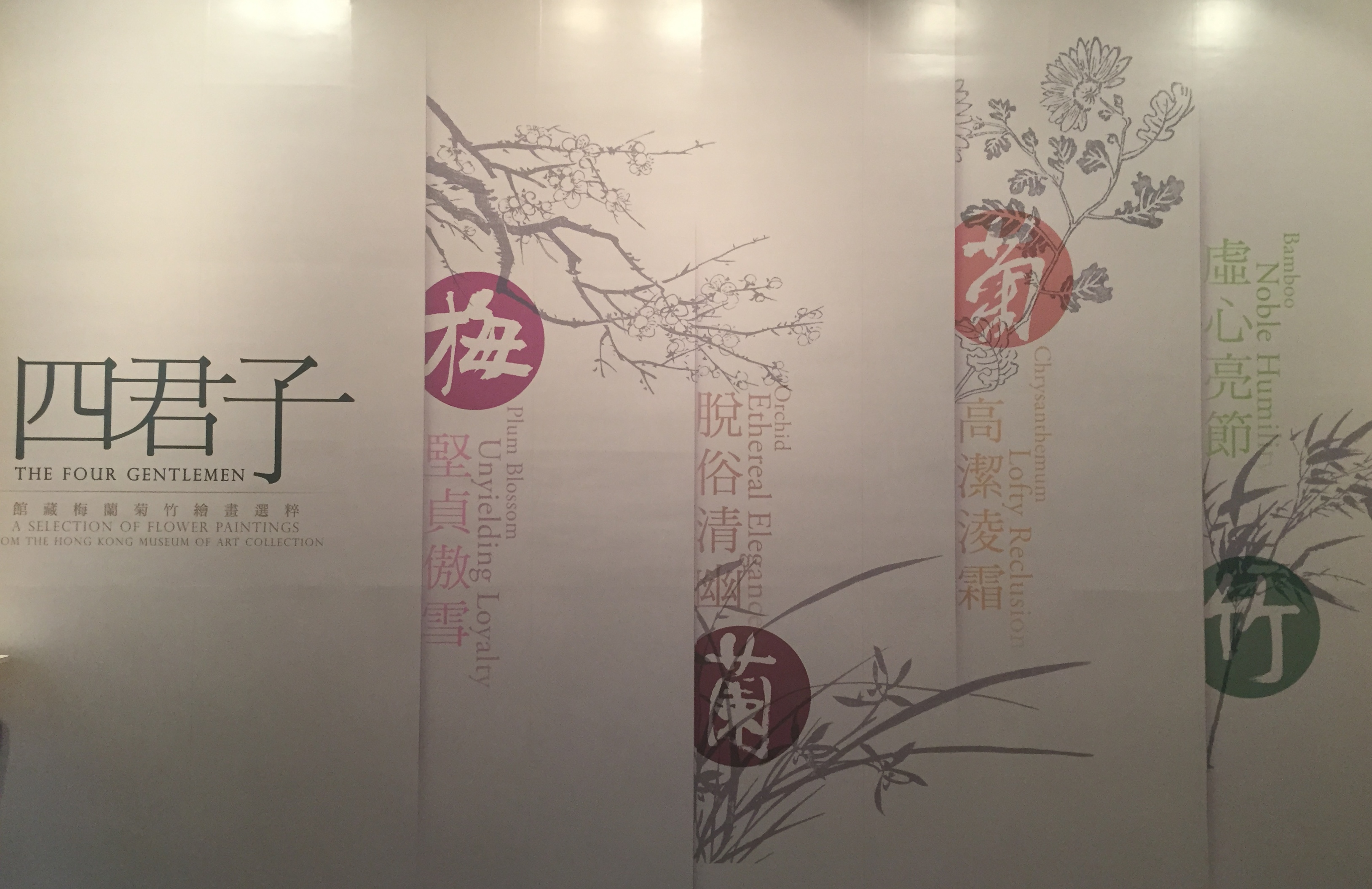
L’exposition – Les Quatre Gentlemen

Les Quatre Gentlemen

Presque tous les chinois traditionnels savent ce que signifie « Les quatre gentilshommes ».  Cette expression « Les Quatre gentlemen » apparaissant  aussi sous le nom des « Quatre nobles plantes » correspond dans l’art chinois aux quatre plantes : l’orchidée, le bambou, le chrysanthème et la fleur de prunier.

L’analogie est issue d’une inscription du Manuel de peinture de ces quatre plantes, écrite pendant le règne de Wanli de la dynastie des Ming par le peintre lettré, Chen Jiru.  Le Manuel montre qu’on pourrait purger les impuretés de l’esprit pour atteindre un caractère noble en appréciant et apprenant les vertus des « Quatre gentlemen ».  Dans la culture chinoise des gens lettrés, la fleur de prunier qui fleurit en hiver symbolise les qualités fermes et inflexibles de Junzi : un gentleman ou un homme noble; l’orchidée qui pousse dans les vallées sereines, avec son arôme rafraîchissant, symbolise un caractère élégant au mépris de la vulgarité; le bambou vertical dressé vers les nuages ​​représentant  l’humilité; le chrysanthème qui subsiste en automne et résiste au givre manifeste la force de l’intégrité. Les calligraphes célèbres, les peintres et les écrivains, comme Tao Yuanming (365-427) et Su Shi (1037-1101), utilisent fréquemment le thème de la fleur de prunier, de l’orchidée, du bambou et du chrysanthème dans leurs peintures et leurs poèmes pour glorifier les intentions et les sentiments d’un gentilhomme.  L’expression compare les quatre plantes à l’homme de bien du confucianisme.  Elles sont le plus souvent représentées dans des lavis et appartiennent à la catégorie des « peintures de fleurs et oiseaux ».  C’est un thème favori des lettrés qui identifie les vertus confucéennes telles l’intégrité, la fidélité et la persévérance à ces quatre fleurs.  Dans l’art vernaculaire, les images des fêtes du Nouvel An chinois utilisent couramment « Les Quatre gentlemen » comme les symboles du bonheur.  Par exemple : « Les fleurs de prunier vous apportent le bonheur » et « Le bambou transmet la paix et le bien-être ».

Parmi « Les Quatre gentlemen », le bambou est apparu dans les peintures murales au cours de la dynastie des Tang, comme l’ont fait les peintres Wu Daozi (680-759) et Wang Wei (701-761).  Pendant les premières dynasties Song et Yuan, « Les Quatre gentlemen » ont été également admirés par les lettrés et les peintres – Wen Tong (1018 – 1079) était connu pour ses peintures à l’encre de bambou, le moine Zhongren (1051-1123) et Yang Buzhi (1097-1169) pour leurs peintures de fleurs de prunier.  À la fin de la dynastie des Song du Sud, Zheng Sixiao (1241 – 1318) a utilisé une orchidée déracinée pour illustrer la perte du pays en faveur d’une puissance étrangère.

Au début, « Les trois amis de l´hiver », également connus sous le nom « Les trois amis du froid », font référence aux trois plantes : le pin, le bambou et la fleur de prunier.  Cela représente la compagnie dans l’adversité.  L’orchidée est ajoutée plus tard pour faire l’ensemble « Les quatre amis ».  Les chrysanthèmes ont commencé à être représentés au cours de la période des Cinq Dynasties et des Song du Nord, bien que moins de peintres les utilisent comme objet de peinture par rapport au reste des trois autres plantes.  Jusqu’aux dynasties Ming et Qing, l’expression « Les Quatre gentlemen » est officiellement apparue dans les manuels de peinture et, est devenue une catégorie de peinture individuelle populaire.

La fleur de prunier – la loyauté inébranlable

La fleur de prunier est la première parmi les quatre gentlemen car elle fleurit au début de l’année. Elle ne succombe pas au givre durant sa floraison en hiver et apporte un arôme rafraîchissant et subtil annonçant l’approche du printemps.  Depuis l’antiquité, les peintres considèrent la fleur de prunier comme la représentation des qualités de l’homme idéal.  On admire le courage intrépide et inflexible de la fleur et la considère comme une incarnation de la noblesse et de l’intégrité.

Dans la dynastie des Tang, les fleurs de prunier étaient souvent représentées dans des lavis appartenant aussi à la catégorie des « peintures de fleurs et oiseaux » et « peintures de paysages ».  Jusqu’à la dynastie des Song du Nord, les « peintures de fleurs et oiseaux » ont prédominées et la fleur de prunier est devenue le sujet principal à apparaître seul dans les peintures.  Zhongren (1051-1123) et Yang Buzhi (1091-1169) étaient des artistes connus pour leurs peintures de fleurs de prunier.  Zhongren a planté des pruniers dans le monastère pour réaliser ses œuvres à l’encre en utilisant l’encre de différentes densités pour les pétales et l’approche « désossée » pour les branches.  Le successeur de Zhongren, Yang Buzhi, a inventé une façon de représenter les fleurs en peignant les pétales en lignes doubles et en utilisant des points pour manifester les étamines.  Les branches ont été exécutées en traits texturés secs avec une pointe de pinceau centrée.  Cette technique de peinture a été suivie par les peintres contemporains et de nombreuses œuvres ont hérité de ce style.

D’ailleurs, la fleur de prunier a été souvent utilisée comme un thème de poème.  L’écrivain Lu You des Song du Sud (1125 – 1210) a adoré les fleurs de prunier toute sa vie, et a produit plus d’une centaine de poèmes et de la prose prônant la fleur de prunier.  Rétrogradé en raison de sa position politique contre les princes de la dynastie Jin, Lu You avait utilisé la fleur de prunier comme une métaphore pour proclamer sa noble ambition et son intégrité morale.

L’orchidée – l’élégance éthérée

À l’état sauvage dans les vallées montagneuses, le long des rivières et dans les crevasses des falaises, l’orchidée se distingue de la banalité.  Ses feuilles minces avec de la verdure toute l’année et ses fleurs d’un arôme délicat expriment l’élégance.  Depuis les temps anciens, les peintres et les poètes admirent l’orchidée.  Confucius a dit que l’orchidée émettait son parfum pour les rois et l’a utilisée comme une métaphore de la voix d’un fonctionnaire vertueux qui est tombé en disgrâce, à tort ou à raison, dans la cour où il a été banni par l’empereur.  Il a aussi mis en valeur l’intégrité de l’orchidée en la comparant aux hommes nobles qui sont capables de cultiver la philosophie Dao et respecter leurs vertus même dans la difficulté ou la pauvreté.

Au cours de la fin de la dynastie des Song et du début du Yuan, les lettrés, les poètes et les peintres démontrent leur intégrité en prônant les orchidées comme le thème central de leurs œuvres. Zheng Sixiao (1241 -1318) a vécu une vie recluse à Suzhou après avoir été banni de la cour de dynastie des Song. Dans son œuvre célèbre d’orchidée à l’encre, l’artiste a peint une seule plante sans sol, sans racine pour signaler l’idée que « l’homme noble reste seul sans se mêler aux gens déshonorants » et pour signifier qu’il ne voulait pas être enraciné dans une terre gouvernée par la puissance étrangère.

Pour les contemporains, les techniques occidentales ont également eu une influence sur la peinture d’orchidée chinoise qui a été représentée par le dessin et l’aquarelle aboutissant à une fusion des styles chinois et occidentaux.

Le chrysanthème – la réclusion noble

Le chrysanthème fleurit en automne lorsque toutes les autres fleurs se fanent, montrant une caractéristique qui a été appréciée par les lettrés chinois à travers l’histoire. Le chrysanthème était décrit dans l’histoire comme étant : « le chrysanthème précieux; son semis pouvant être mangé, il a une valeur médicinale et peut être employé dans la fabrication des oreillers, et pourrait être utilisé pour brasser le vin ».

Tao Yuanming (365 – 427) est un écrivain chinois qui est considéré comme un des plus grands poètes inspirés par le taoïsme. Il chante, dans ses poèmes, la retraite à la campagne et le vin.  L’un de ses textes les plus connus est La Source des fleurs de pêcher, qui décrit un village loin du monde dans une vallée cachée.  Tao Yuanming est aussi l’auteur du Chant du retour, texte dans lequel il parle de son retour chez lui, à la campagne, après avoir quitté son métier de fonctionnaire.  Dans un de ses poèmes, il a écrit sur les chrysanthèmes. «…rassembler les chrysanthèmes par la clôture de l’Est, je regarde tranquillement les montagnes du sud ».  Tao lie souvent son caractère et son tempérament de réclusion aux nobles idéaux. Pour les successeurs, le chrysanthème est devenu un symbole de Tao Yuanming et a donc été souvent représenté dans les peintures.

Au 20e siècle, de nombreux peintres ont cherché à faire évoluer les formes artistiques.  À Shanghai, un groupe de peintres dirigé par Wu Changshuo (1844 – 1927) intègre les techniques, les structures de la calligraphie et de la gravure de sceaux dans la peinture.

Le bambou – l’humilité noble

Depuis l’antiquité, le bambou est le symbole de la vertu de l’intégrité, de la modestie et de la dignité.  Le bambou montre la force, la douceur, la loyauté et la justice.  Les lettrés chinois, au travers des genres différents, représentent le bambou dans leurs poèmes et peintures comme une référence au noble idéal d’humilité.

Dès la période des Six Dynasties, le bambou a déjà été fréquemment représenté dans les peintures. Les Sept Sages de la forêt de bambous, qui étaient mécontents de l’autorité à la cour, vivaient reclus dans une bambouseraie.  Ils lurent et écrivirent des poésies exprimant leur préoccupation pour le pays et leur impuissance face à ses problèmes.

Deux artistes maîtres de la dynastie des Song du Nord Wen Tong (1018 – 1079) et Su Shi (1037 – 1101) étaient d’ardents admirateurs du bambou.  Wen Tong est connu pour son talent à exécuter une peinture de bambous précise  et vivante, dès le premier jet, après avoir observé le sujet minutieusement en détail avant de commencer son ouvrage. Su Shi remplace l’encre noire avec le cinabre pour peindre le bambou; cela a exercé un impact énorme sur les peintres suivants.

Au cours de la dynastie des Yuan où la Chine était sous la gouvernance de l’empire mongol, la peinture du bambou est devenue populaire en raison de son implication dans sa résistance contre la domination mongole. Les artistes de la dynastie Yuan ont aussi intégré des éléments calligraphiques dans la peinture. Ce style a été suivi par les peintres contemporains de la dynastie Ming.

L’exposition

Plus de 70 œuvres de la collection du musée allant de la dynastie Ming à la période moderne ont été sélectionnées pour cette exposition. Elles sont représentées dans cinq catégories.

« Les Quatre gentlemen » ont longtemps été étroitement associés à la culture traditionnelle chinoise. Junzi est un aspect important de la philosophie chinoise représentant une personne d’un très haut niveau de moralité après celle d’un sage.  Aujourd’hui, les gens vivent une vie trépidante.  S’ils pouvaient respecter les vertus des « Quatre gentlemen » et influencer leurs contemporains avec de telles qualités de bienveillance, un monde meilleur pourrait être créé.

(Exposition jusqu’au 2 août 2015 à Hong Kong Museum of Art)


Cindy

image (2)          53d154554156486e385c7d40_TwitterBlack-Circle-Icon_Email1-940x940download

A / AN “ “ – Bachelor of Arts (Fine Art) Graduation Exhibition 2015

Having the chance to catch the last day (27th July 2015) of the exhibition A / AN “   – Bachelor of Arts (Fine Art) Graduation Exhibition 2015 held at the Hong Kong Arts Centre, I was completely amazed to see the enormous creativity and talent of the students.

I couldn’t help sharing in here my experience.  The exhibition was co-presented by The Royal Melbourne Institute of Technology University (RMIT) and The Hong Kong Art School.  There were total 36 graduating students participating in this exhibition.  The artworks reflect the dedication, personal ideology and unique concepts across the modalities of Painting, Photography and Sculpture.

Incompleteness and unlimited possibilities

On the first glance, the title A/AN “      “ appeared unexplainable and ambiguous.  Along the visit, I got to know more about its meaning.  The blank “      “ actually hinted at the notion of “incompleteness and unlimited possibilities” inherent in both the artworks and the emerging artists.  On one hand, it denoted the dilemma faced by most artists – When is a work of art finished?  Is it ever finished?  Does it need to be “complete”?  On the other hand, it allowed the viewers to have their own interpretations on the artworks.

From Left 1 & 2: The artist tried to capture the tiniest changes; slowest pace and the most fragile growth within the objects. Those traces left by time and life.  By using a set of layered images, she tried to reflect the ambience that she experienced.

From left 3: The 3 pieces are respectively My Wanchai, My Central and My Causeway Bay.  As an introvert observer, the artist recorded the conversations of passers-by on the street.  The work investigates the ‘urban tension’ between oneself and the surrounding and shows the alienation between people living in the community.

From left 4: The artist found a cross point and a connection between her grandmother, her mother and her when she discovered that her mother had also helped her grandmother to pick up useful stuffs from the junkyard to home in the past.

Unstrained imagination

Imagination is an intrinsic underlying element with which the viewers could interpret the artworks in a certain direction, or it could be towards no direction.  The “      “ was left blank in order to let the viewers fill in their own meanings.  There could be infinite possibilities, unstrained imagination or suggestions.  The exhibition enhances our self-awareness towards our surroundings.

Art is dead?

In the art history, the saying “art is dead” appeared at several critical turns in the artistic genres.  For instance, the emerge of abstraction which worked to counteract the figuration has ignited the debate on the criteria of aesthetics.  In the eighties Postmodernism era, the saying “painting is dead” was aroused when large numbers of artists turned their works to installation, video art etc.  In Hong Kong, it has been said for long that “art is dying” especially when we see that the industry is giving way to the urbanisation and commercial activities.  Nevertheless, when I looked into the creativity of these emerging artists, I was fueled with positivity.  Over three years, the graduating students’ enthusiasm in arts has been frequently confronted with the complicated hard work, and yet they have made it!  This exhibition is not the end but the starting point of another art journey ahead, for the students and the future art scene of Hong Kong.

(The exhibition was ended on 27th July 2015)


Cindy

image (2)          53d154554156486e385c7d40_TwitterBlack-Circle-Icon_Email1-940x940download

Japonism

Japonism, Japonism, Japonism…

It is the word to describe my existing mental status.  If not the tsunami at Tōhoku in Japan, I would have already studied in Japan.  The school registration was all ready and suddenly came the outbreak of the crisis.  If I were not given the chance to go to France for the language course, I would have already taken the offer for a Master’s study in Buddhism in Hong Kong.  Life is amazing.  Everything starts from a point and end on the same, like a circle.  Things intermingled and then after going miles’ way you find yourself doing what you should have done at the very first instant.  Today, I start to do my research in Japanese Zen paintings.  Zen, in fact is originated from the Buddhism in China.

But Japonism does not really mean my passion to the culture of Japan.  The term Japonism refers to the late 19th century European craze for Japanese art, fashion and aesthetics.  In art, it refers notably to fans, screens, lacquers, bronzes, silks, porcelains and ukiyo-e woodblock prints – which arrived in huge quantities from Japan, following the decision taken in 1854 by the Tokugawa Shogunate to open up its seaports to international trade with the West.  The ukiyo-e has the advantage of cheap mass-production, making them universally accessible.

“Japonism” exerted a vigorous influence in France (Japonisme in French), especially among painters of the impressionism, by bringing to the artists the new ideas in terms of composition, color, and design.  The European artists made reference to the distinctive Japanese imagery from ukiyo-e and grafted them into their own works.  Examples are the cherry blossoms, lanterns, kimonos, and temples.

Ukiyo-e helped reshaping the techniques and the aesthetic expression of western art.   It typically features prominent outlines (rooted in the Japanese reverence for calligraphy), and areas of flat and vibrant color.  Shadows are generally omitted.  This influence was obvious in the colors and compositions of Édouard Vuillard, Henri de Toulouse-Lautrec and above all Vincent van Gogh.

Hiroshige and Van Gogh

Utagawa Hiroshige (1797 – 1858) was one of the most famous Japanese ukiyo-e artists, considered the last great master of that tradition.  Best known for his landscapes, Hiroshige has greatly influenced French Impressionists such as Monet and Vincent Van Gogh.  For instance, the Flowering Plum Tree (1887) from Japonaiserie of Van Gogh and his Bridge in the rain (1887) were inspired respectively by the works of The Plum Garden in Kameido (1857) and the Sudden Shower Over Shin-Ohashi Bridge and Atake (1857) of Hiroshige.

The Exhibition: Fiber Futures in Paris

At the height of this Japonism, I went to La Maison de la Culture du Japon in Paris and discovered a very interesting exhibition: Fiber Futures.

The works of 30 Japanese artists fascinated my eyes with their metamorphosis of textiles in this exhibition.  The exhibition had already taken place in New York, San Francisco, Helsinki, and Madrid.

Fiber art emerged in the 1960s.  In Japan, it is acting as a framework through which artists are able to re-examine their ancestral traditions through a contemporary angle.  Indeed, the country has a rich history of dyeing and weaving, techniques which are re-appropriated by Japanese contemporary artists nowadays.

We can find in the exhibition the intermingling of art, craftsmanship, and design.  These contemporary Japanese artists transformed fabrics into sculptures, pictures, emulations of nature by using materials ranging from silk, cotton, recycled cocoons, antique paper scraps, jute, hemp, stainless-steel wire and synthetic fiber.  They transform, bend, divide and reuse the fiber.  The creation of Machiko Agano is one of the most impressive works for me.  The artist presented an artificial forests cut out from mirror card and suspended from the ceiling.  The work infuses in the space with the reflections resulted from the sunshine at the exterior.  The idea of ecology is transmitted through this work.

La Maison de la Culture du Japon at Paris

At the end of the exhibition, we can ask for the posters of the previous, current or coming exhibitions for free.  There is also a small bookstore selling Japanese decorations and books.  This House of Japanese Culture also organize workshops like making and tasting of Japanese noodles – Sobas, sake tasting, Japanese tea history and tasting, etc.  Conferences on cultural topics and courses in Japanese are also available in the House.

(Exhibition of Fiber Futures is open from 6 May to 11 July 2015)


Cindy

image (2)          53d154554156486e385c7d40_TwitterBlack-Circle-Icon_Email1-940x940download

The flood of Céleste Boursier-Mougenot takes over Palais de Tokyo

Acquaalta of Céleste Boursier-Mougenot

After waiting for a month, the new summer exhibition at Palais de Tokyo is officially opened to public today.  Being a fan of this “Palais” of contemporary art, I can’t wait but rushing all my way to explore the new stuffs there.

What has bombarded me in the first place is the Acquaalta of Céleste Boursier-Mougenot, which is set at the entrance level of the museum.  Acquaalta refers to the exceptional tide peaks that occur periodically in the northern Adriatic Sea. The peaks reach their maximum in the Venetian Lagoon and cause partial flooding of Venice.  The artist is representing France in carrying out his project rêvolutions at the French Pavilion of the 56th Venice Biennale (9 May – 22 November 2015) in which he transformed the venue into an oneiric and organic island.  I did not get a chance to the Biennale due to the painstaking exams.  It is almost a luxury for me to be able to find the artist’s work Acquaalta here.

The artist creates a lakeside landscape which leads visitors into an experience – tactile, visual and auditory.  Their perception of the space is changed through the journey under the techniques that intermingle music, movement and images.  This journey, in which everyone’s movements take on great importance, takes the audience into an imaginary experience – a journey of their own psyche.  At the end of the journey, we find a zombiedrone, a technique by which the participants’ images are encrypted, leaving only the moving parts to appear on the screen.

The mastering of space, reflection and transformation of images, and the audio effects all work together to give us a new sensory experience.  We may also find this work loaded with poetry in making reference to the myth of Narcissus gazing at his own reflection

Céleste Boursier-Mougenot

Céleste Boursier-Mougenot was born in 1961 in Nice and currently lives and works in Sète. This artist, trained as a musician and composer, has created works by drawing on the rhythms of daily life to produce sound in unexpected ways.  He was the first French prize-winner of the International Studio Program (PS1) in New York, from 1998–99.

Playing around the materiality – Patrick Neu

The summer exhibition is more than just Acquaalta.  Patrick Neu, an artist who works with materials not often found in the art world: bees’wings, lampblack on glass, eggshells, wax, etc., invites us to get into his dialogue with the materials.

His watercolor series Iris put in front of us both the vanity of the blossoming flowers and their fragility.  The period of blossoming of irises never lasts long, at most fifteen days per year.  However, it is already sufficient for Patrick Neu to capture the vanity of this blossom of the flowers.  The artist uses his precise pencil line, outlining the sinuous and delicate flowers on a velvety white paper, followed with a watercolor coating.   Without over-saturated with colors, the natural colors of these flowers together with their vivid forms make them stand out with an unparalleled finesse in a perfectly neutral background.  The artist has carefully chosen the medium to mark his presentation in a natural context – fragile, frameless, simply pinned the delicate painted flowers to the paper.  Under his work, the life cycle and the ephemeral nature of objects give way to a visual poetry.

Patrick Neu was born in 1963, lives and works in Alsace.

More works of the other artists to be explored

Tianzhuo Chen, Jesper Just, Shelly Nadashi, Isabelle Cornaro etc.

(The exhibition is open from 24 June to 13 September 2015 at Palais de Tokyo in Paris)


Cindy

image (2)          53d154554156486e385c7d40_TwitterBlack-Circle-Icon_Email1-940x940download